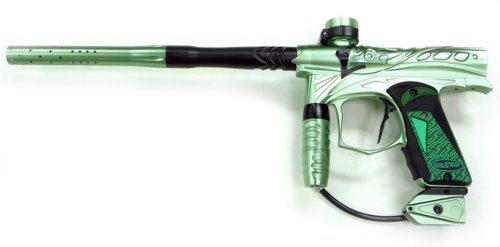
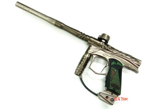
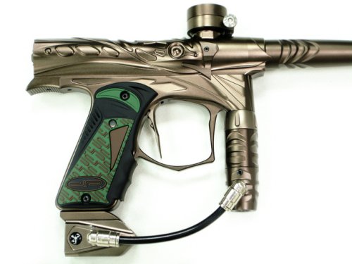
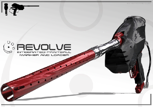
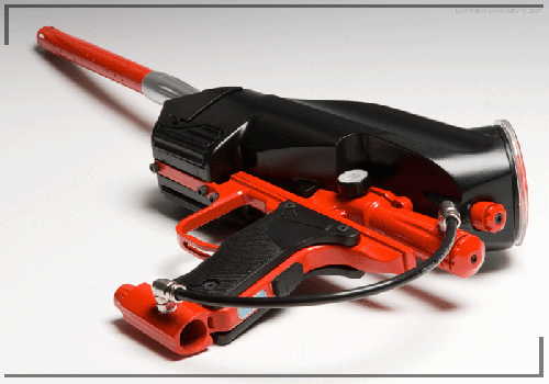
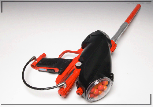
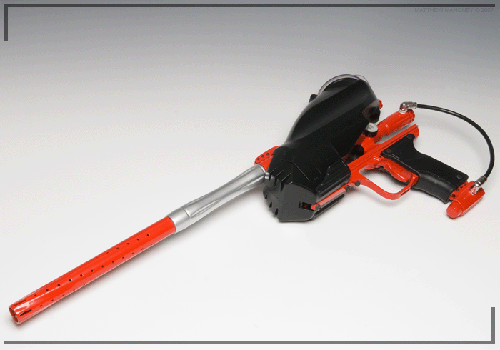
It pretty much looks like a shocker with an ion trigger frame. That’s all I know. Have fun with the pics.
Category: Markers
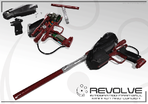
The Revolve. Some Random Prototype Gun
PBStar is all up in arms about some prototype gun an “informant” gave them pictures of. And, I guess, in order to protect this informant, they cover up the owner’s copyright with a nice, ugly PBStar logo. I think it was just so we couldn’t google it.
Here’s the deal with it, from all the research I did in . It was created by Matthew Mahoney (she’s ma honey), a designer in the UK.
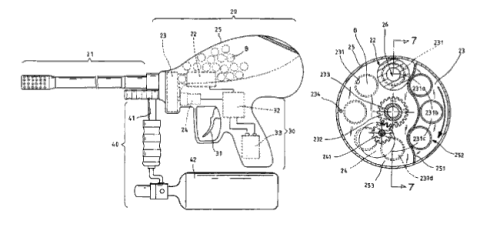
The most notable part is the fact it operates partially like a revolver. The balls go into the revolving disk thing, and are rotated up into the chamber and forms part of the chamber, instead of dropping through a feedneck into a chamber.
It probably doesn’t have a bolt, or at least shouldn’t, since the revolving of the balls should create a seal to allow just air to propel it so the whole bolt action isn’t really needed to seal off the chamber from the feedneck.
In order for the whole revolving action to work, the hopper is a part of the body. It wraps around top and back of the body, instead of being put in a little tiny feedneck. But by having the body inside the already kinda small looking hopper, I think the capacity will be pretty limited.
This looks a lot like the one in a patent issued 2 years ago, but better looking. Instead of a very awkward looking orb on the back, it has a halfway decent looking hopper-like ball holder (uggh).
Anyways, PBStar only had 2 pics up, including the one above, here are all 7. The resizing of the GIFs doesn’t look too great. Click them for the full size versions. More info on this later. It’s 2:30 in the morning right now, and I’m kinda tired.
Here’s the drawing in the patent mentioned earlier
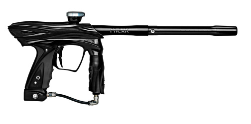
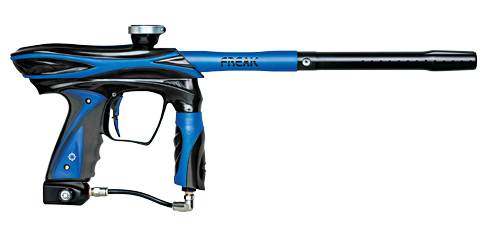
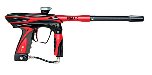
New Black Epiphany Colors
Smart Parts has released new black background Epiphanies. The white on black one looks especially sexy.
New Dark SL74 Color
Dark SL74 is now available in dust khaki and gloss red. Have fun getting one, since only 20 will be made.

Dye Launches New Dyematrix.com
Dye launched a redesign of Dyematrix.com.
If you think they got rid of the gaudy flash, think again. It’s still all done in flash, except for the forums which are using the ever so mediocre Invision Power Boards. It even has some sort of music playing on the home, which the mute button is almost impossible to find, and makes a sound every time you hover over a menu link. Personally, I don’t need an audio confirmation when I hover over a link.
It also now has a few links to YouTube in their “media” section, which, for the most part, are just ads. Though, really, the whole media section is one big ad. You can even view DM7 ads. That’s exactly what I’ve always wanted to do. Too bad Adblock blocks them. And once that’s fixed, they’re still really small.
Sorry, but wouldn’t you think a 2 page ad should have a bit higher resolution.
Come on Dye, you could do much better.
